INTERIOR SUMMARY
In the following you will find a visual extracts of some interior projects we have done over the years. These vary from Wall-Graphics to Office Space Redesign.
Wall Graphics
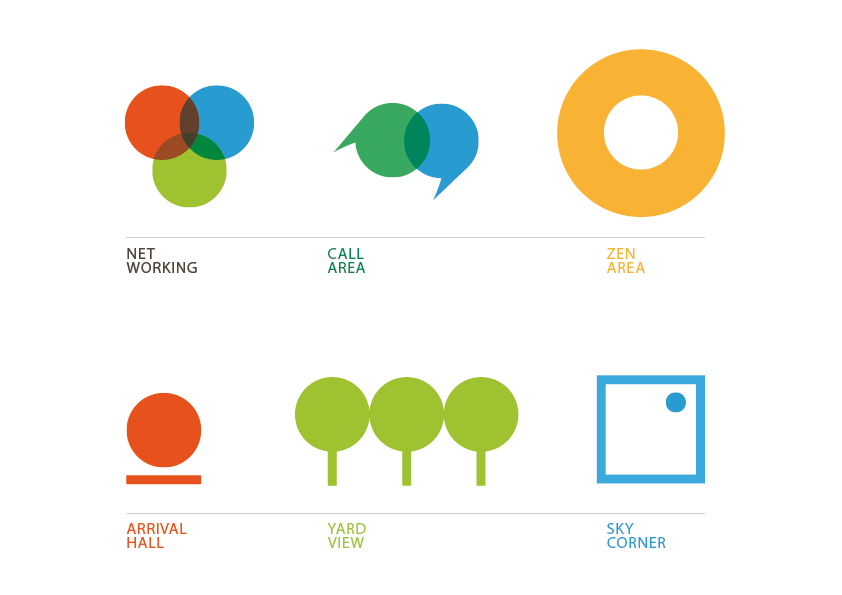
The office space was divided into areas with special usabilities. The circle, a main component of the office brand identity, is the basis of the visualisation for each section. Zones where interaction is a key factor the different shapes overlap.
Office Redesign
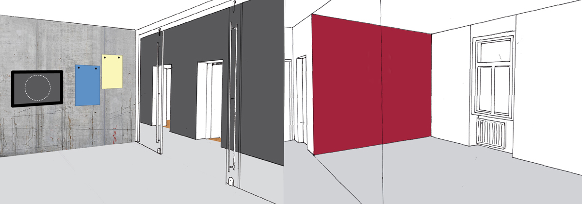
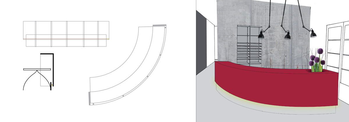
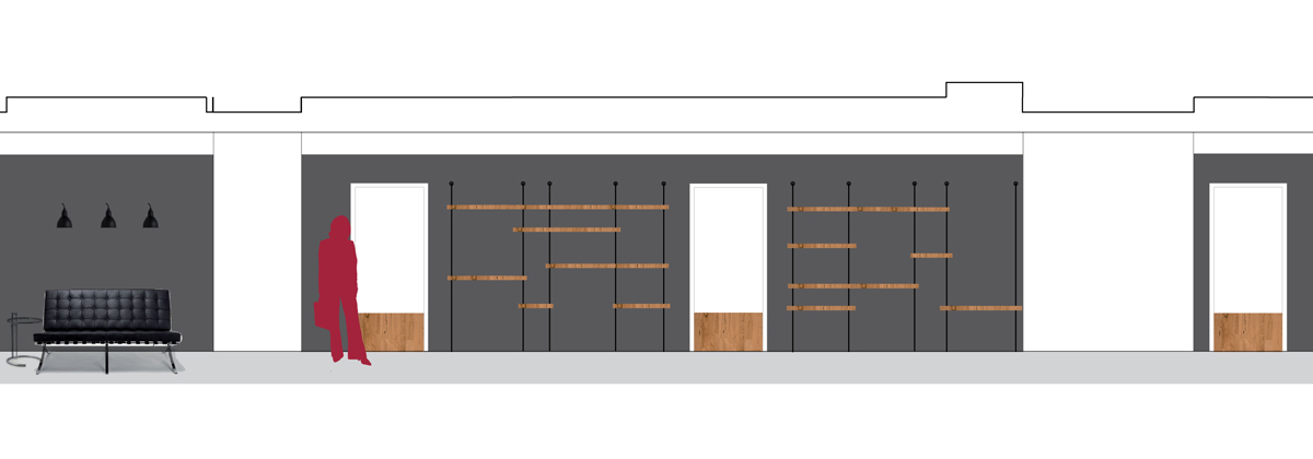
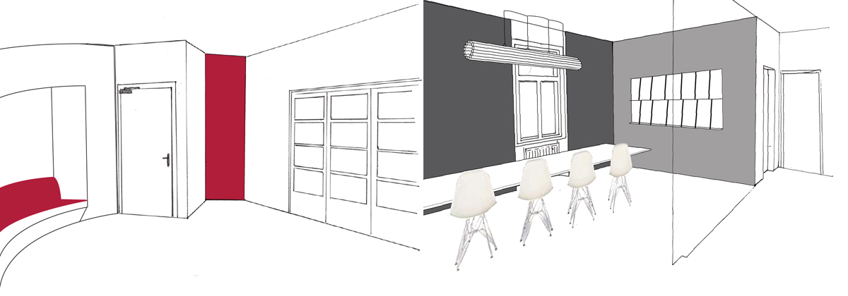
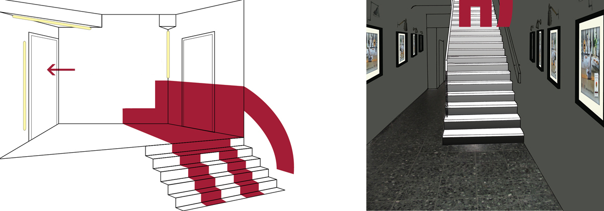
The goal was to pimp the office space with the help of colour, unique shelfs and wallpapers. The reception furniture needed a face lift as well as entrance staircase.
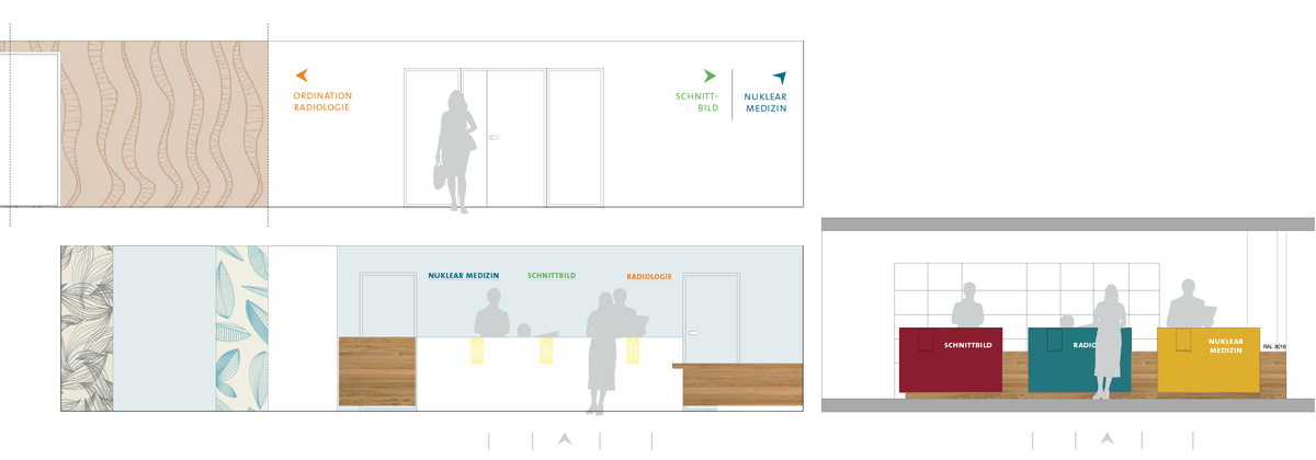
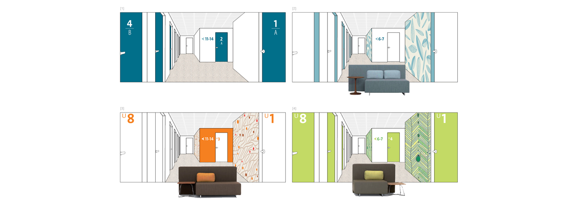
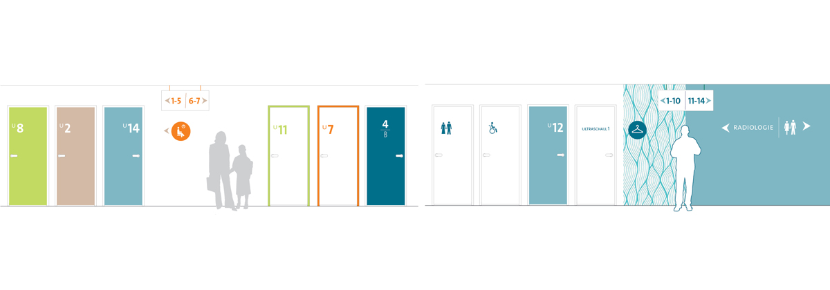
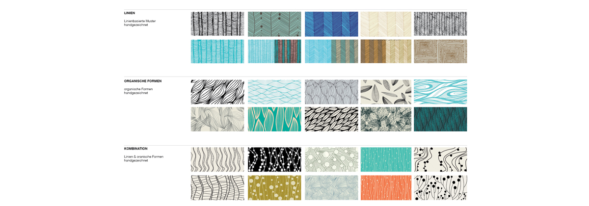
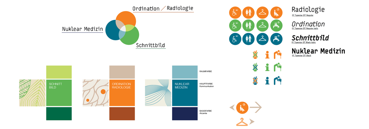
WAYFINDING / INTERIOR MOOD
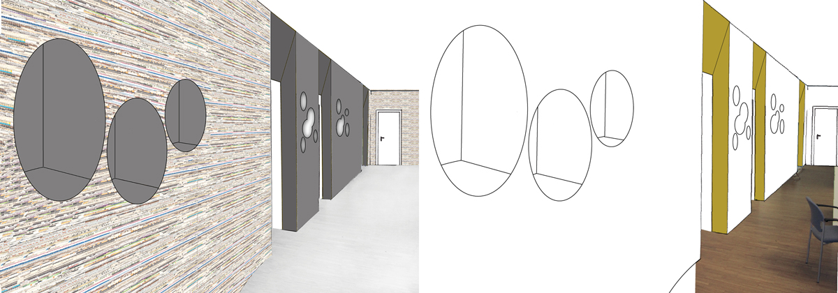
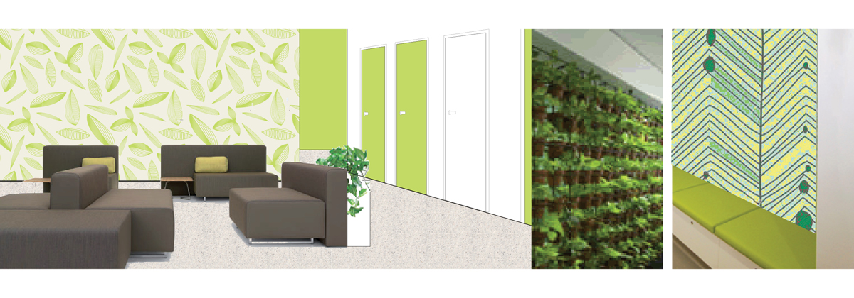
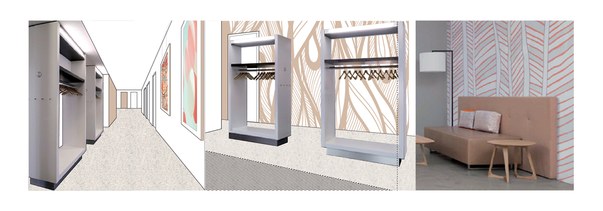
The aim was to incorporate the identity of a group practice into its interior stlyle. Forthermore was it necessary to analyse the patients behaviour to make their stay as pleasant as possible and for them to find their way through the practice.


